Locofy.ai: Bridging UX Design & Development

Finding tools that bridge design and development is a challenge. Recently, I watched an interesting YouTube video that highlighted a robust tool called Locofy.ai which promises to transform designs from commonly used prototyping software into production-ready code.


Click the link below for the video:

“One-Click AI Web Development Tutorial – Learn how to Turn Figma Designs into Working Code using AI”


Key Features and Benefits

Locofy.ai offers seamless integration with popular design tools like Figma and Adobe XD, allowing designers to translate their work into various coding languages and frameworks such as React, HTML-CSS, and Vue.js. This integration is particularly beneficial for:

  • Rapid Prototyping: Speed up the iteration process by quickly turning designs into interactive prototypes.
  • Reducing Development Time: Cut down the back-and-forth typically needed between designers and developers.
  • Quality: Generate clean, maintainable code that adheres to best practices, ensuring a high-quality end product.

Challenges

Despite its benefits, Locofy.ai, like any tool, comes with its set of challenges. Complex designs might require additional manual intervention, and integrating new tools into established workflows can present a learning curve. However, the potential productivity gains and improvements in project outcomes make these challenges worth navigating.


Final Thoughts

For UX professionals, staying ahead of the curve means embracing tools that enhance efficiency and creativity. Locofy.ai represents a significant leap forward in this regard, offering a powerful solution for transforming designs into functional code. As the UX field continues to evolve, tools like Locofy.ai will undoubtedly play a crucial role in shaping the future of design and development.

I’m interested to hear from anyone who has used this tool. Let me know your experiences or thoughts on it in the comments!

https://www.locofy.ai/

Polishing a Professional Identity on LinkedIn

As UX designers, we are fully aware that every interaction counts. Your LinkedIn profile is more than just a digital resume—it is a reflection of your design philosophy, a portfolio of your achievements, and a beacon for future opportunities.

While accomplishing one of my assignments, I found a fantastic article on HubSpot that helped reshape my approach to professional networking I wanted to share.

The Ultimate Cheat Sheet for a Perfect LinkedIn Profile


Article Key Takeaways

There were 21 “steps” in this article, but I found these to be the most impactful points that are most likely often overlooked.

  • First Impressions Count: Starting with a professional photo and a banner that reflects your design ethos sets the tone for your profile. It’s about making a visual statement before a word is even read.
  • The Art of the Summary: Crafting a summary that captures your passion for UX, your key accomplishments, and what drives you is crucial. It’s your pitch to the world, encapsulating your professional identity and aspirations.
  • Showcasing Work and Achievements: Utilizing LinkedIn’s ‘Featured’ section allows you to highlight your best work, including UX projects, articles, or presentations. It’s a visual portfolio embedded within your professional narrative.
  • Skills and Endorsements: Highlighting relevant UX design skills and actively seeking endorsements from colleagues and mentors bolsters your credibility and expertise in the field.

Why Not Treat Your LinkedIn Profile Like A UX Project?

Approaching your LinkedIn profile like a UX project—centered on the user (in this case, potential employers or collaborators), rich in content, and designed for engagement—can transform how the world sees you.

Just like UX projects, it should be user-friendly, engaging, and informative. The principles you apply in your work—clarity, accessibility, and aesthetic appeal—should also guide how you sculpt your professional online presence.

As UX designers, we have the tools and the creative insight to tell our stories compellingly. The guidance from HubSpot’s article serves as a framework for polishing our professional profiles to reflect our unique journeys and the value we bring to the table.


Final Thoughts

Let’s leverage our LinkedIn profiles to not just narrate our past experiences, but also open the door to future opportunities. It’s about making every connection, every endorsement, and every project showcased a stepping stone toward our dream roles and collaborations.

Remember, in a world where UX is more relevant than ever, your LinkedIn profile is the UX of your professional identity. Make it intuitive, engaging, and most importantly, make it yours.


Please share your tips on what you think makes a great LinkedIn profile in the comments!

The Next Chapter for Niche Nest Furniture: Brand Building & More

In my latest endeavor with the Niche Nest Furniture brand, the fictional high-end online furniture store has started to take on a life of its own, transforming from ideas into a visually tangible and immersive experience. Here’s a closer look at the progress I’ve made and the new skills I’ve acquired along the way.


Understanding Niche Nest Furniture


Typography and Color Schemes

A significant portion of my recent efforts has been directed towards meticulous research on typeface and color schemes. The chosen palette (2) evokes a sense of warmth and sophistication, while the typography (1 & 2) reflects the brand’s approachability and high standards. These decisions were not made lightly, as they greatly influence the perception and effectiveness of the website.


Logo Finalization: A Brand’s Identity

The logo of Niche Nest Furniture has finally taken shape, embodying the elegance and craftsmanship of the products it represents. The process involved countless iterations, seeking a balance between modernity and timelessness. The finalized logo is not just a symbol but a statement, marking the brand’s identity and its promise of delivering excellence in every piece of furniture.


High-Fidelity Prototype: Bringing the Vision to Life

The High-Fidelity phase was crucial for visualizing the final look and feel of the website, allowing me to refine user interactions and ensure a seamless experience. Utilizing tools like Adobe XD, I’ve been able to simulate the user journey, from browsing furniture collections to checking out.


Keep an eye on this space for further updates. The evolution of Niche Nest Furniture is an ongoing story, and I’m eager to share every step of this exciting journey.

And if you have any tips or suggestions for Niche Nest Furniture, please let me know in the comments!
The Little Things That Matter: Micro-Interactions in UX

Ever notice those tiny, almost invisible things on your apps and websites that make you smile? Micro-interactions, a term that’s buzzing in the UX community, are those tiny, functional moments that, when designed well, significantly enrich the user’s journey and weave in subtle magic.


What Are Micro-Interactions?

Micro-interactions are the subtle touches that accomplish a single task and yet have a powerful impact. They exist in the swipes, clicks, and typing we do on our devices. Far from being just decorative, their role is to engage and surprise users, making digital experiences feel more human, intuitive, and personal.


Some of the Roles of Micro-Interactions

  • Navigation: They guide users effortlessly through your website, creating a flow that feels intuitive and seamless.
  • Feedback: They offer immediate and relevant responses to user actions, reinforcing the sense of direct manipulation and control.
  • Instruction: Subtly and effectively, they provide hints or nudge users towards desired actions without being intrusive.
  • Communication: Through visual cues, they inform users about what’s interactive and what’s not, demystifying user interfaces.
  • Emotion: With their charm, micro-interactions infuse emotion into your site, transforming routine tasks into delightful experiences.

Why They Matter

A lot of the time micro-interactions are the heroes of design. These aren’t just cool effects; they’re communications that say, “I thought about you when I built this.” They can turn the mundane into the extraordinary and elevate a website from functional to fantastic.


See What It’s All About

Want to explore some examples of great micro-interactions? Here are some sites that provide a visual explanation and inspiration for your next project:

https://www.awwwards.com/awwwards/collections/animation

https://uxplanet.org/10-inspiring-progress-bars-that-delight-users-460f3b3f913b

https://dribbble.com/search/microinteractions


Final Thoughts

At the end of the day, it’s these little moments that stick with us, creating an experience that’s memorable for all the right reasons. They remind us that good design is about creating feelings of connection and delight, even in the briefest of interactions.

How will you weave micro-interactions into your next design? Share your thoughts or projects in the comments!

Facing the Future: Embracing the Challenges of UX Design in 2024

In 2024, the UX design landscape is bustling with new talents, making the field seem crowded, challenging, and perhaps, to some, a bit daunting. A recent video (view below or at https://www.youtube.com/watch?v=zBug7KVSVjk) I came across is a follow-up video to five main reasons one might reconsider becoming a UX designer this year. Malewicz turns all of the reasons why you should reconsider into why you SHOULD still become a UX designer–but it’s going to be tough. He outlines what you should do to succeed.

“This is my goal for this community – to provide you both hard truths AND ways to still thrive. Without hacks, shortcuts and micro-tips – only a clear path forward.”

– Malewicz

The Video’s Five Points

  1. The Crowded Market
    • It’s true, that the market is teeming with designers, but overcrowding isn’t synonymous with no opportunity. The video suggests gaining experience through freelance work and volunteering for non-profits. This can set you apart from the crowd, as real-world projects add tangible value to your resume.
  2. The Perception of Boredom
    • Design can be as exciting as you make it. While some companies may lean towards safe and conventional designs, there’s always room for innovation. Seeking employers who value creativity can lead to more stimulating work.
  3. Over-Optimization
    • Yes, the field is becoming more optimized, but the video encourages speaking up and contributing original ideas in meetings. There’s still a place for designers who are proactive and vocal about their unique perspectives.
  4. AI Takeover
    • AI is shaping up to be a powerful tool in design, but it’s not a substitute for strong design fundamentals. Those who understand the principles can harness AI as an ally rather than see it as a competitor.
  5. The Trap of Dark Patterns
    • Ethical design is in demand, and taking a stand against dark patterns can be part of your brand. Aligning with companies prioritizing ethical practices can help avoid contributing to deceptive design practices.

The Action Plan

Malewicz presents this video in an aggressively honest way that I can appreciate and personally, I respond and am motivated to make a change or do my best when this is the way it is delivered.

But, he doesn’t just present challenges; he offers an action plan. The design world is tough and constantly evolving, and success requires dedication.

Those who are willing to put in the effort, continuously learn, and embrace the evolving nature of design can still find a rewarding career in UX.


Final Thoughts

The points raised in the video are not just cautionary tales but also a blueprint for aspiring designers to carve out a niche in a competitive field. UX design in 2024 demands adaptability, continuous learning, and an ethical stance. It may not be easy, but for those with passion, the field is as promising as ever.

What are your thoughts on the state of UX design in 2024? Share your plans for tackling these industry challenges in the comments below.

A Little Update

I try to not let assignments go to waste and interconnect them where I can.

Recently I began a new project creating a responsive E-commerce website for a fictional high-end online furniture store specializing in wood furniture called “Niche Nest Furniture”.

Sometime soon after I graduate, I will continue to try my hand at refinishing furniture as a side hustle, so I would eventually like to take what I have learned and some of what I have done from these projects and use it for this later on.

So far these are some of the steps I have taken for the responsive e-commerce website.

Sitemap: Created in Miro

Digital Desktop Wireframes: Created in Adobe XD

Digital Mobile Wireframes: Created in Adobe XD

So far my impressions of Adobe XD have been very positive and it seems like a very powerful competitor to Figma. We were also introduced to Sketch this week, and it seems good but it is unfortunate that they have not expanded their full software to PCs. I am automatically turned off from all companies who don’t seem like they have the desire to leave Apple’s proprietary eco-system. I do appreciate a lot of the features within Sketch that seem to make designing very intuitive.

Animation

I was also given the task to make a simple animation for my Audio/Video Media course to familiarize yourself with Adobe Premiere. The only requirement was that the animation had to “tell a story” and be 15 seconds long.

I have converted the mp4 to a GIF in order to share it here because—I’m pretty proud of how it turned out and think it’s pretty cute!

Quick & Easy Design Inspiration

As a designer, I’m always on the lookout for new sources of inspiration to keep my creative juices flowing. Recently, I have been using a few quick and dirty get-the-job-done resources that have become my go-to for sparking creativity with ease.


UX Design & Layout Inspiration

When faced with creative block, my journey often begins on Behance and Dribbble. A quick search with keywords like “UX,” “Landing page layout,” or “Case Study” unveils a treasure trove of stunning designs. Yes, the sheer talent on display sometimes triggers a bit of impostor syndrome. But more importantly, it ignites a storm of ideas to overcome the block I’m facing.


Color Palette Inspiration

When it comes to color palettes, Pinterest has been an unconventional but invaluable tool. Typing in “Moody color palette” or “Orange color palette” offers up a spectrum of shades on one page without the hassle of sifting through a color generator. That said, I’ve also been dabbling with Huemint (pictured above), which is a fantastic tool when I do decide to go down the color generator path.


Logo & Hero Image Inspiration

For logos and hero images, I’ve leaned into Canva quite a bit. It’s perfect for those initial bursts of inspiration, and I often find myself transferring these early concepts into more specialized software for further refinement.


Last, but Furthest from Least

Adobe Express. What can I say? It has been a revelation. This platform is a one-stop shop for various design needs—from whipping up quick mockups and beautifying resumes to experimenting with graphic design ideas. Their extensive template library is a goldmine for when I need a creative kickstart.


Final Thoughts

Each of these tools has simplified the way I approach design. They’ve not only made inspiration more accessible but also enhanced the efficiency of my design process. By incorporating these easy resources, I can spend less time searching for inspiration and more time creating—pushing the boundaries of what I can achieve with my designs.


Where do you get your inspiration? Leave them in the comments, I would love to hear more!

Discovering Miro: My New Go-To Tool for UX & Web Design

https://miro.com

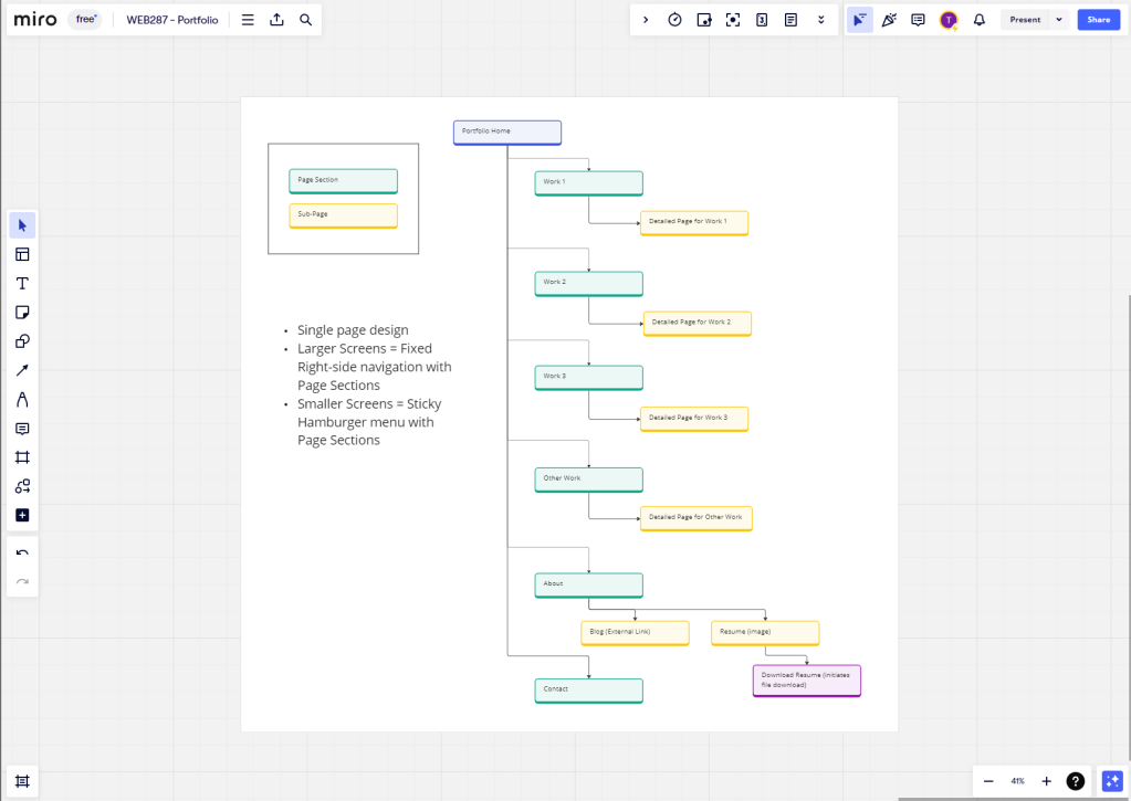
I’ve recently discovered a game-changing online tool called Miro, and it’s quickly become my favorite resource in the realm of UX and web design. I used it to create an aesthetically pleasing sitemap for a portfolio page (pictured above), however, the possibility and capability that Miro seems to offer for those in my field are underrated and should be spotlighted.

Miro stands out for its simplicity.

Effortless Ideation and User Journey Mapping

Miro has seamless and aesthetically pleasing brainstorming and user flow mapping capabilities. The infinite canvas and user-friendly drag-and-drop feature can transform how I organize ideas and visualize user pathways. It was remarkable to see how these initial steps of design can become more efficient and engaging.

An Efficient Workspace

Transitioning directly from broad concepts like user flows to specific wireframe designs on its giant whiteboard canvas is where Miro can truly shine. The platform’s straightforward wireframing tools can allow me to sketch out the basic structure of web pages/apps with ease in the same space, providing a solid foundation for more intricate design work later on.

Unmatched Collaboration

The real game-changer has been Miro’s collaborative features. I can see that it is superior to programs like Figma in the realm of collaboration, especially when it comes to involving non-designers in the design process who will be able to step into this program with ease needing no additional training to provide feedback/engage with projects. Its intuitive interface is a breath of fresh air compared to other complex design softwares in this regard. This level of inclusivity ensures a more cohesive and comprehensive approach to each project, making everyone feel involved and valued.


Final Thoughts

Miro introduces new ideas on how I can approach workflows in UX and web design and is an effective tool in making it more collaborative, inclusive, and efficient. Its focus on visual collaboration and user-friendliness not only streamlines the design process but also makes it a more enjoyable and creative journey. I can’t recommend Miro enough to fellow designers looking for a tool that truly enhances the way we work.

Crafting My Identity: The Story Behind My Personal Brand Mood Board

In the world of design, consistency speaks volumes. For one of my latest assignments, I crafted a mood board that echoes the continuity of my brand while offering a glimpse into my design narrative—minimalist yet dynamic, organized yet personal.


The Philosophy Behind the Board

Minimalism meets dynamism in my brand’s aesthetic, a philosophy that believes less is more unless it’s a burst of creativity—represented by the vibrant splashes of orange on my mood board. It’s a dance between simplicity and energy, resonating with the work I aspire to create.

The Narrative of Organization and Personal Connection

The organized workspace depicted in the laptop image is my ode to structure—a promise of clear, logical, and purposeful design. Yet, amidst the order, there’s always room for a warm conversation, symbolized by the inviting cup of coffee. I envision meetings with clients where stories unfold over a hot beverage, fostering connections that go beyond business.

Design with Empathy

“Your story matters.” This isn’t just a statement; it’s a commitment. My mood board holds space for the stories, views, concerns, and opinions of those I design for. It’s an empathetic ear in visual form, ready to listen and transform understanding into user-centered experiences.

Elegance with Intent

Did you notice the plants? They’re not just a decor item; they’re a metaphor for elegant and purposeful design. Just like my designs, they’re meant to be both beautiful and functional.


Final Thoughts

This mood board is a visual conversation with the viewer, about who I am as a designer—a blend of the professional and the personal, the minimalist and the dynamic, the organized and the empathetic. As I near the completion of my studies, it’s a compass that will guide my creative decisions and client interactions.

What elements define your personal brand? I invite you to share your journey and join the conversation about the art of personal branding in design.

Resume Writing in the Competitive Field of Design

Reflecting on the recent updates to my resume as I near graduation from Wake Tech’s Web & UX Design program, I incorporated key strategies from this article

18 Résumé Writing Tips to Help You Stand Out

This article features pivotal tips that reshaped my approach to crafting a resume that stands out in the competitive field of design.

  1. Customization is Key: Tailoring my resume to align with specific job descriptions ensured that I highlighted the most relevant skills and experiences, making it more appealing to potential employers.
  2. Achievements Over Duties: I shifted the focus to what I’ve accomplished in my projects and roles, rather than just listing my responsibilities. This approach showcases my contributions and the impact of my work more effectively.
  3. Strategic Use of Keywords: Incorporating industry-specific keywords from job listings has made my resume more ATS-friendly, increasing the chances of it being seen by human eyes.
  4. Design Matters: As a design student, the visual layout of my resume is just as important as the content. I made sure it reflected my design skills and personal brand without compromising on clarity and professionalism.

These adjustments have not only improved the presentation of my resume but have also boosted my confidence as I prepare to enter the professional world.

For fellow students and aspiring designers, these insights can be a guide to refining your resumes, ensuring they reflect your best self.

Have you recently updated your resume with some innovative strategies? I’d love to hear about your experiences and any tips you might have. Reach out or share in the comments!

Design a site like this with WordPress.com
Get started